If you’re an artist who loves painting landscapes like me, then you’ve probably run into the issue with some of the elements in your composition looking too close or flat. Creating a sense of depth can be tricky and complicated, especially if you’re just learning how to paint landscapes. In this session, I’m going to be mentioning a few key points to consider for creating realism in your backgrounds.
Direct observation
First, let’s talk about observing directly from nature; I believe this is one of the best places to start if you’re truly interested in creating a realistic atmosphere. Whether it’s a picture or you’re painting en plein air, it helps to sit down and really consider and study the laws of nature. For many years, I struggled immensely trying to create realism in my compositions and wondered why they always looked off in some way, until I decided one day to take a walk in the woods and realized, while I was observing some deciduous tree leaves, that how I saw objects and how I perceived them were quite different. I realized that most of the colors I used were incorrect for that specific level of atmosphere, my shapes looked lifeless and my perspective made no sense. It’s amazing how caught up we can get in our heads that we paint things the way we “see” them as opposed to how they actually look.
Color realism
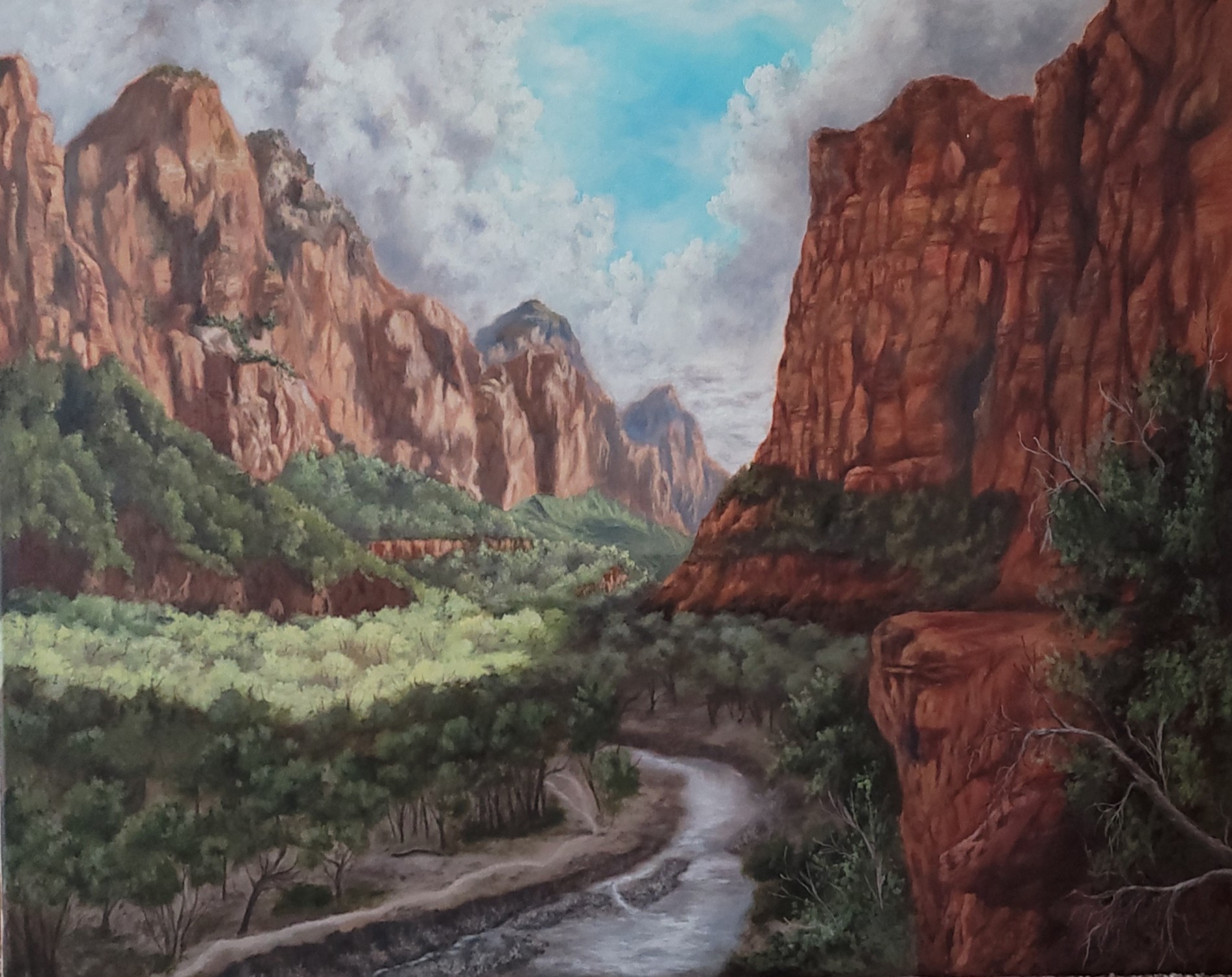
When I started painting more from direct observation and painting what I actually saw, not what my mind fabricated, I started to notice with objects that were farther away, the degradation of hard lines and edges and the distortion of local color; this phenomenon is known as color realism. Color realism is a style where accurately portrayed colors create a sense of space and form. Color realism in the background of my painting below

As you can see with the painting above, when painting far away objects, instead of focusing on form and textured detail, you would paint the object in accordance with how the colors interact with atmospheric perspective, the reflection of light bouncing off other objects and the location of shadows.
Odd looking shapes create depth
When painting far away objects, it’s important to remember how shapes will change because of linear perspective and distance. Objects tend to distort and morph into shapes that feel unnatural and almost uncomfortable to paint. A lot of times you might think to yourself,”that definitely isn’t right,” but the laws of perspective demand shapes that seem absurd.
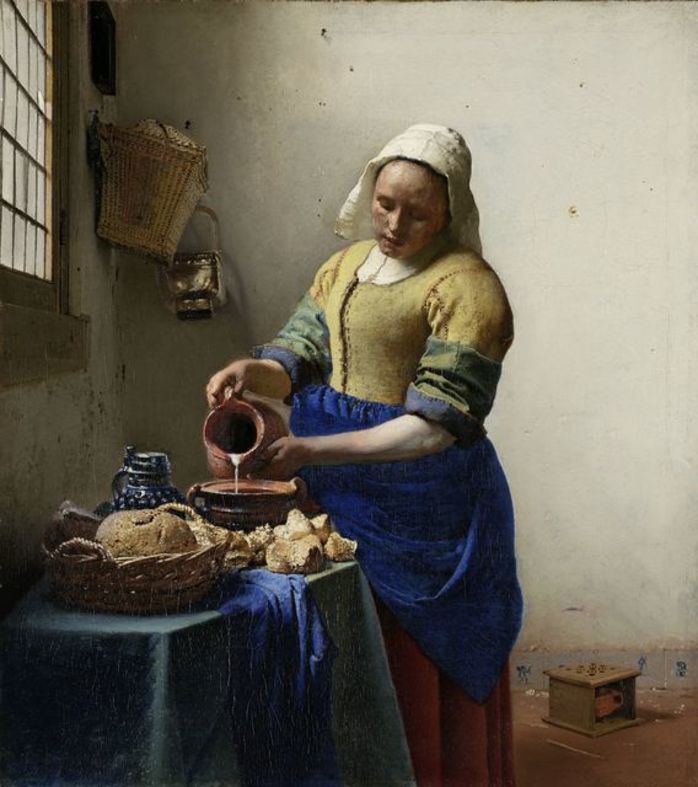
Johannes Vermeer was a master of color realism: The Milkmaid, 1658-1660.
Color wavelengths for depth
When painting far away objects and backgrounds, remember the colors, as previously mentioned, will be effected by atmospheric perspective; so as a general rule of thumb, you would make your tones paler and lighter and your values with less gaps in the greyscale range than you would with the mid-ground and foreground. You should consider the type of color for your backgrounds; because certain colors have longer and shorter wavelengths on the visible spectrum, it’s important to understand which colors will work for distance, depending how far away your objects are.
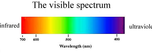
Blues and violets have shorter wavelengths but a higher frequency whereas reds and yellows have longer wavelengths but shorter frequencies. Blues and violets translate best for distance but it really does depend on how far away your objects are, how the light is diffusing color, etc.
Conclusion
All the topics I’ve discussed in today’s session are things I’ve learned over the years that have really helped me achieve that sense of depth and realism I feel a lot of artists struggle with. I hope that this has been helpful.
